Lab 4
Jan 28
Goals
- F-tests
- Estimated means, confidence intervals and prediction intervals
Comparing models
When one model is a special case of another (can be obtained by specifying values for some parameters) they can be compared using an extra Sum of Squares F-test. A common example is comparing the separate lines to parallel lines model (the parallel lines model is the separate lines model with the coefficients on the interaction terms are zero). The simpler model (the one with fewer parameters) is our null model. A small p-value in the extra sum of squares F-test, gives evidence against the simpler model. In R, you fit both models with lm, then use the anova function to do the test,
library(Sleuth3)
# separate lines model
fit_bat_sep <- lm(log(Energy) ~ log(Mass) + Type + log(Mass):Type, data = case1002)
# parallel lines model
fit_bat <- lm(log(Energy) ~ log(Mass) + Type, data = case1002)

# extra sum of squares F-test
anova(fit_bat, fit_bat_sep)
## Analysis of Variance Table
##
## Model 1: log(Energy) ~ log(Mass) + Type
## Model 2: log(Energy) ~ log(Mass) + Type + log(Mass):Type
## Res.Df RSS Df Sum of Sq F Pr(>F)
## 1 16 0.553
## 2 14 0.505 2 0.0484 0.67 0.53In this case we have no evidence against the parallel lines model.
Another common use is to compare models where a continuous variable could be treated as a categorical variable (like a lack of fit F-test). For example, thinking back to the Meadowfoam example, we could compare a model with a set of indicator variables for Intensity to a model where Intensity enters as a continuous variable,
load(url("http://stat512.cwick.co.nz/data/case0901.rda"))
fit_contin <- lm(Flowers ~ Intensity + Time, data = case0901)
fit_indic <- lm(Flowers ~ factor(Intensity) + Time, data = case0901)
anova(fit_contin, fit_indic)
## Analysis of Variance Table
##
## Model 1: Flowers ~ Intensity + Time
## Model 2: Flowers ~ factor(Intensity) + Time
## Res.Df RSS Df Sum of Sq F Pr(>F)
## 1 21 871
## 2 17 767 4 104 0.57 0.68A p-value of 0.6848 give us no evidence against the simpler model, treating Intensity as continuous. Or in other words, we have no evidence against the mean number of flowers being a straight line function of Intensity.
Why can’t we put Mass in as an Indicator variable in the echolocating bat study?
Estimated means, confidence intervals and prediction intervals
We are going to use part 1 of homework 3 as our starting point. Let’s say I’ve decided on the following model:
library(Sleuth3)
fit <- lm(log(Income2005) ~ AFQT + Educ + Gender, data = ex0923, na.action = na.exclude)
The argument na.action = na.exclude is new for you. R automatically ignores observations with missing values (NAs) but this additionally tells R to return NA for residuals or predictions for these observation with missing values. There is no harm in always having it in your call to lm.
One way to explore the structure of our model, is to create estimates of the mean response at various values for the explanatory variables. The first step is to set up a new data.frame that describes all the explanatory values we are interested in. Let’s estimate a mean log Income, for every combination of gender, with all the unique values of years of education, and intelligence score in steps of 10 from 0 to 100.
newdf <- expand.grid(
  Educ = unique(ex0923$Educ),
  AFQT = seq(0, 100, 10),
  Gender = unique(ex0923$Gender)
  )
Take a look at new df. Each row specifies, values for the explanatories we want to estimate the mean at. The first for example, is a male, with a score of zero on the AFQT and 12 years of education.
** Why didn’t I want to estimate the mean for a AFQT score of 110?**
expand.grid creates a data.frame from all combinations of the supplied variables. unique finds all possible values that occurred in the data, so for example in the Gender column it returns, male and female. If you are curious try running just the parts on the RHS of the equals, i.e.
unique(ex0923$Educ)## [1] 12 16 14 13 17 15 19 18 9 11 10 20 7 8 6seq(0, 100, 10)## [1] 0 10 20 30 40 50 60 70 80 90 100unique(ex0923$Gender)## [1] female male
## Levels: female maleWe can get the estimated mean income using the predict function
predict(fit, newdata = newdf) Remember, the estimated mean response is the same as the predicted response. This returns 330 numbers, one for each row of our newdf data.frame, so let’s store them in a new column called est_mean in newdf,
newdf$est_mean <- predict(fit, newdata = newdf) Now, it’s up to us to explore different ways of plotting the results to explore the model. Here’s one idea, mean income against education, with lines joining the intelligence levels, faceted by gender.
qplot(Educ, est_mean, data = newdf, colour = AFQT, geom = "line",
  group = AFQT) + facet_wrap(~ Gender) + ylab("Log Income")
Here’s another, mean income against intelligence, just for 12 years of education, but a different line for males and females,
qplot(AFQT, est_mean, data = subset(newdf, Educ == 12), geom = "line",
  colour = Gender)+ ylab("Log Income")
These are on the log scale, but we can backtransform our mean by taking the exponential of our estimated mean.
qplot(AFQT, exp(est_mean), data = subset(newdf, Educ == 12), geom = "line",
  colour = Gender) + ylab("Estimated median income")
Fit a new model that adds a Educ:AFTQ interaction, and repeat the above plots. Describe the change in the modelled means.
Adding confidence intervals
Let’s add some confidence intervals on the mean response.
Compare the structure of these two commands (i.e. use str)
predict(fit, newdata = newdf)
predict(fit, newdata = newdf, interval = "confidence")
In the second line, the interval = "confidence" argument asks for confidence intervals on the mean response to be returned as well as fitted values. The first command returns a vector of 16 numbers and that’s why it can be saved directly into a new column in newdf above. The second command returns a list of data.frame with 3 columns. It doesn’t make sense to store three columns in one column so instead we join it to our newdf data.frame with cbind (short for column bind)
cis <- predict(fit, newdata = newdf, interval = "confidence")
cbind(cis, newdf)
newdf <- cbind(cis, newdf)
head(newdf)
Now we can use this newdf to plot our confidence interval on the mean response, but to keep our plot simple for now, let’s do one education level for males (see the subset in the data argument below),
# a single line for mean response
qplot(AFQT, fit, data = subset(newdf, Educ==12 & Gender == "male"),
  geom = "line")
# add another line for upper limit of CI
qplot(AFQT, fit, data =  subset(newdf, Educ==12 & Gender == "male"),
    geom = "line") +
  geom_line(aes(y = upr), colour = "red")
# and another for the lower limits
qplot(AFQT, fit, data =  subset(newdf, Educ==12 & Gender == "male"),
    geom = "line") +
    geom_line(aes(y = upr), colour = "red") +
    geom_line(aes(y = lwr), colour = "red", linetype = "dashed")
I used different line types just to illustrate which is which.
Another option is to use a ribbon for the interval
qplot(AFQT, fit, data =  subset(newdf, Educ==12 & Gender == "male"), geom = "line")+
    geom_ribbon(aes(ymin = lwr, ymax = upr), linetype = "dotted",
alpha = I(0.2)) 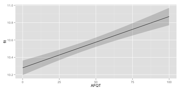
Try plotting the estimated mean income for both mean and women with 12 years of Education with confidence intervals. Add colour = Gender, to the qplot function to make sure the two lines are drawn separately.
qplot(AFQT, fit, data = subset(newdf, Educ==12), colour = Gender, geom = "line")+
geom_ribbon(aes(ymin = lwr, ymax = upr), linetype = "dotted",
alpha = I(0.2)) 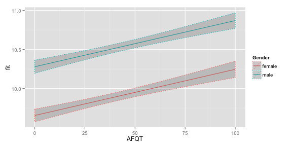 If you want to see the estimated median response on the original scale just back-transform the mean and interval endpoints
qplot(AFQT, exp(fit),
  data =  subset(newdf, Educ==12 & Gender == "male"), geom = "line")+
    geom_ribbon(aes(ymin = exp(lwr), ymax = exp(upr)), linetype = "dotted",
    alpha = I(0.2))
Adding prediction intervals
Prediction intervals can be produced by using the interval = "prediction" argument in predict.
pis <- predict(fit, newdata = newdf, interval = "prediction")
head(pis)
If you try to add the results of predict to newdf you’ll run into a problem where you have multiple columns called fit, lwr and upr. One way around this is to rename the columns before cbinding them to newdf.
colnames(pis) <- c("pi_fit", "pi_lwr", "pi_upr")
newdf <- cbind(pis, newdf)
head(newdf)
Then we can add them to our plot
qplot(AFQT, fit,
  data =  subset(newdf, Educ==12 & Gender == "male"), geom = "line") +
    geom_ribbon(aes(ymin = lwr, ymax = upr), linetype = "dotted",
    alpha = I(0.2))  +
    geom_ribbon(aes(ymin = pi_lwr, ymax = pi_upr),
    alpha = I(0.2))